🤖 03 基础控件与布局
在软件开发中,界面设计与功能开发同样重要,美观的界面可以吸引更多的用户。Android 提供了大量的 UI 开发工具,让开发者可以编写出各种各样的界面。本章我们一起来学习 Android 的 UI 开发。
目前 Android 有两种编写界面的方式,一种是在 Android 诞生之初就存在并且沿用至今的 View 体系,另一种是 Android 新晋推出的新一代 Android UI 开发框架 Jetpack Compose。在第一行代码的系列中,我们会先介绍目前应用范围更广的基于 View 体系的 UI 开发,Jetpack Compose 的知识会在后续的系列中介绍。
在 View 体系下开发 Android UI,如之前文章中一些示例代码所展示,我们需要在 res/layout 目录下建立 XML 格式的布局文件,在其中添加一些 UI 控件和布局容器,排列界面上的元素。然后在 Activity 中引入布局文件,并通过 findViewById() 的方式根据 id 获取到某个控件的句柄,也就是布局文件中某个控件的实例对象,调用它提供的方法来完成 更新数据、显示或隐藏控件、绑定用户点击事件 等逻辑。
基础控件
介绍了整体编写界面的方式,下面我们来介绍下 Android 系统为开发者提供的一些常用控件。
Android 提供了大量的系统 UI 控件,不太可能在这篇文章中一一介绍完全,仅选择最基础、最常用的一些控件来进行讲解。
TextView
TextView 可以说是 Android 中最基础的一个控件,之前的文章也见过它的基本使用。TextView 的作用是在界面上显示文本信息。下面来看看 TextView 的更多用法:
创建一个 TextViewDemoActivity,引用布局文件 activity_textview_demo.xml,布局文件中的代码如下所示:
<LinearLayout
  xmlns:android="http://schemas.android.com/apk/res/android"
  android:layout_width="match_parent"
  android:layout_height="match_parent"
  android:orientation="vertical">

  <TextView
    android:id="@+id/text_view"
    android:layout_height="match_parent"
    android:layout_width="wrap_content"
    android:text="This is TextView" />

</LinearLayout>
外层的 LinearLayout 是布局容器,后面会介绍,这里先忽略。看下 TextView 中设置的属性:
-
通过
android:id给当前 TextView 定义一个唯一标识符,用于在 Activity 中通过findViewById()找到这个 TextView 控件,来对控件进行一些操作。 -
使用
android:layout_width和android:layout_height指定控件的宽度和高度,,Android 中所有的控件都有这两个属性,可选值有三种: -
match_parent:表示让当前控件的大小和父布局的大小一样 -
wrap_content:表示让当前控件的大小能够刚好包裹住内容 -
固定值:表示给控件指定一个固定的尺寸,单位一般使用dp,这是一种屏幕密度无关的尺寸单位,可以保证在不同分辨率的手机上显示效果尽可能一致,如50dp就是个有效的固定值 -
通过
android:text给 TextView 设置了要显示的文案。
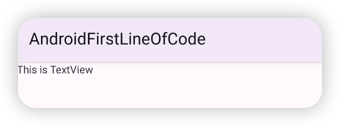
上面的代码是让这个 TextView 的宽度和父布局一样宽,也就是手机屏幕的宽度,高度是显示的文案所占的高度。运行效果如下:
这样看不出 TextView 的宽高,我们给它加一个背景色来显示布局的边界。使用 android:background 添加背景色。
<TextView
  android:id="@+id/text_view"
  android:layout_height="match_parent"
  android:layout_width="wrap_content"
  android:text="This is TextView"
  android:background="#F0F0F0" />
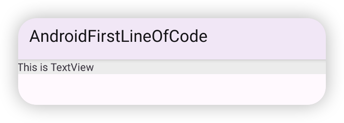
这样就可以看出 TextView 的高度和宽度了。
还可以对 TextView 的文字大小和颜色来进行修改:
<TextView
  android:id="@+id/text_view"
  android:layout_width="match_parent"
  android:layout_height="wrap_content"
  android:text="This is TextView"
  android:background="#F0F0F0"
  android:textColor="@color/colorPrimary"
  android:textSize="20sp"
  />
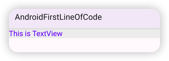
通过 android:textColor 指定文字的颜色,可以是#FFF、#F0F0F0、#FF000000 这样的颜色值,也可以是 @color/colorPrimary 这样的颜色引用。
通过 android:textSize 来指定文字的大小,要使用 sp 作为单位,这样用户在系统中修改了文字显示尺寸时,应用的文字大小也会随之变化。
下面罗列一些开发中常见的控件的属性:
| XML 属性 | 说明 |
|---|---|
android:id | 为控件设置一个唯一标识符 |
android:layout_width | 设置控件的宽度 |
android:layout_height | 设置控件的高度 |
android:layout_marginandroid:layout_marginTopandroid:layout_marginBottomandroid:layout_marginStartandroid:layout_marginEnd | 外边距设置的是控件边缘和其他空间边缘的间距。 设置控件的外边距(上下前后四边间距相同)设置控件据上边控件的间距设置控件据上边控件的间距设置控件据前边控件的间距设置控件据后边控件的间距注意:这里的前后是需要区分 LTR(Left to Right)和 RTL (Right to Left)的。 Start 在 LTR 语言中是代表左边,在 RTL 语言中代表右边。 |
android:layout_gravity | 设置控件在父控件中的对齐方式,默认是左上角对齐(top | start)。 可选的值有: top:在垂直方向向上对齐bottom:在垂直方向向下对齐 start:在水平方向上靠前(LTR 靠左,RTL 靠右) end:在水平方向上靠后(LTR 靠右,RTL 靠左) center:在水平、垂直方向上都居中 center_vertical:在垂直方向上居中 center_horizontal:在水平方向上居中 可以用 | 来同时指定多个值。 |
android:gravity | 设置控件内部内容的对齐方式,默认是左上角对齐(top | start)。 可选的值有: top:在垂直方向向上对齐bottom:在垂直方向向下对齐 start:在水平方向上靠前(LTR 靠左,RTL 靠右) end:在水平方向上靠后(LTR 靠右,RTL 靠左) center:在水平、垂直方向上都居中 center_vertical:在垂直方向上居中 center_horizontal:在水平方向上居中 可以用 | 来同时指定多个值。 |
android:paddingandroid:paddingTopandroid:paddingBottomandroid:paddingStartandroid:paddingEnd | 内边距设置的是控件边缘和控件中显示的内容的间距。 设置控件的内边距(上下前后四边间距相同)设置控件上边的内间距设置控件下边的内间距设置控件前边的内间距设置控件后边的内间距 |
android:background | 设置控件的背景,可以是 Color 或者是 Drawable。 |
TextView 常见的属性有:
| XML 属性 | 说明 |
|---|---|
android:text | 给 TextView 设置文字 Java API:setText() |
android:textColor | 设置文字颜色 Java API:setTextColor() |
android:textSize | 设置文字大小,单位是 spJava API:setTextSize() |
android:maxLines | 设置文字最大的行数,超过指定的行数内容会被截断 |
android:ellipsize | 指定当内容超出 TextView 的宽度时,内容被省略的样式。 可选值如下: none:直接截断start:文字开头位置被 ... 代替middle:文字中间位置被 ... 代替end:文字最后位置会被 ... 代替marquee:文字横向滚动效果 |
篇幅所限只能列出一些常用的属性,更多的用法可以参考 TextView 官方 API 文档。
Button
Button 表示一个按钮,是和用户交互的一个重要控件。在 XML 布局中加入 Button:
<?xml version="1.0" encoding="utf-8"?>
<LinearLayout xmlns:android="http://schemas.android.com/apk/res/android"
    android:orientation="vertical"
    android:layout_width="match_parent"
    android:layout_height="match_parent">
    <Button
        android:id="@+id/button"
        android:layout_width="match_parent"
        android:layout_height="wrap_content"
        android:text="This is Button" />
</LinearLayout>
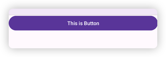
Button 最重要的就是给它设置点击事件,也就是调用 setOnClickListener 方法。这个方法需要转入一个 View.OnClickListener 对象,一般有两种方式来实现。
一种是让 Activity/Fragment 实现 View.OnClickListener 接口,重写 onClick 方法,在这个方法里根据 View 的 id 来判断是哪个控件被点击了,以此来确定执行对应的逻辑,然后 button.setOnClickListener(this) 直接传入 Activity/Fragment 对象。
class ButtonDemoActivity: AppCompatActivity() , OnClickListener {

    private lateinit var button: Button

    override fun onCreate(savedInstanceState: Bundle?) {
        super.onCreate(savedInstanceState)
        setContentView(R.layout.activity_button_demo)
        button = findViewById(R.id.cp_button)
        button.setOnClickListener(this)
    }

    override fun onClick(v: View?) {
        if (v?.id == R.id.cp_button) { // 判断点击 View 的 id
            Toast.makeText(this, "You clicked a Button", Toast.LENGTH_SHORT).show()
        }
    }
}
另一种是使用匿名内部类,直接创建一个 View.OnClickListener 接口的匿名实现类设置给 button.setOnClickListener 方法:
class ButtonDemoActivity: AppCompatActivity() {

    private lateinit var button: Button

    override fun onCreate(savedInstanceState: Bundle?) {
        super.onCreate(savedInstanceState)
        setContentView(R.layout.activity_button_demo)
        button = findViewById(R.id.cp_button)
        button.setOnClickListener(object : View.OnClickListener {
            override fun onClick(v: View?) {
                Toast.makeText(this@ButtonDemoActivity, "You clicked a Button", Toast.LENGTH_SHORT).show()
            }
        })
    }
}
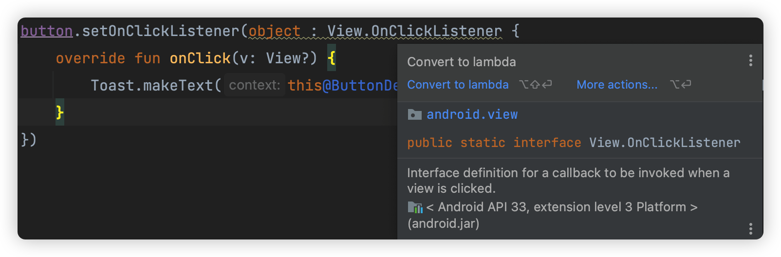
因为 Java 单抽象方法接口的特性,这个匿名实现类可以用 Lambda 表达式来代替,Android Studio 也会给出对应提示:
button.setOnClickListener {
    Toast.makeText(this, "You clicked a Button", Toast.LENGTH_SHORT).show()
}
在 Kotlin 中,我们也可以使用函数对象来代替接口表示点击事件:
onClick: ((View) -> Unit)?
除了设置点击事件监听器,另一个比较常用的是设置长按事件监听器(setOnLongClickListener(View.OnLongClickListener)):
// 写法 1
button.setOnLongClickListener(object: OnLongClickListener {
    override fun onLongClick(v: View?): Boolean {
        Toast.makeText(this@ButtonDemoActivity, "You long clicked a Button", Toast.LENGTH_SHORT).show()
        return true
    }
})
// 写法 2
button.setOnLongClickListener {
    Toast.makeText(this, "You long clicked a Button", Toast.LENGTH_SHORT).show()
    true
}
其他的 API 这里就不多做介绍,更多 Button 控件的用法参考 Button 官方 API 文档。
EditText
在使用应用时,用户常常需要输入一些内容,比如发短信、发微博、微信聊天,登录输入手机号、密码等等。EditText 就是一个输入框控件,可以让用户输入和编辑内容,然后在程序中处理这些用户输入的内容。
<?xml version="1.0" encoding="utf-8"?>
<LinearLayout xmlns:android="http://schemas.android.com/apk/res/android"
    android:layout_width="match_parent"
    android:layout_height="match_parent"
    android:orientation="vertical">

    <EditText
        android:id="@+id/et_input"
        android:layout_width="match_parent"
        android:layout_height="wrap_content"
        />
    <Button
        android:id="@+id/btn_show_input"
        android:layout_width="match_parent"
        android:layout_height="wrap_content"
        android:text="Show input content"
        android:layout_marginTop="10dp" />
</LinearLayout>
class EditTextDemoActivity: AppCompatActivity() {

    private lateinit var editText: EditText
    private lateinit var button: Button

    override fun onCreate(savedInstanceState: Bundle?) {
        super.onCreate(savedInstanceState)
        setContentView(R.layout.activity_edittext_demo)
        editText = findViewById(R.id.et_input)
        button = findViewById(R.id.btn_show_input)
        button.setOnClickListener {
            val text = editText.text.toString()
            val message = if (text.isEmpty()) {
                "You didn't type anything"
            } else {
                text
            }
            Toast.makeText(this, message, Toast.LENGTH_SHORT).show()
        }
    }
}
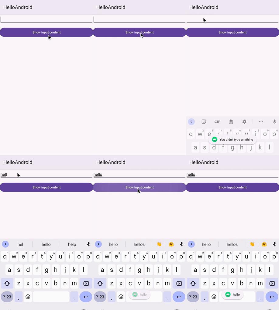
上面代码演示了一个小例子,页面上有一个 EditText 输入框和一个 Button 按钮,当点击按钮时,会获取输入框中的内容,如果没有输入内容,则展示内容为 You didn't type anything 的 Toast,如果输入框中有内容,则展示输入的内容。
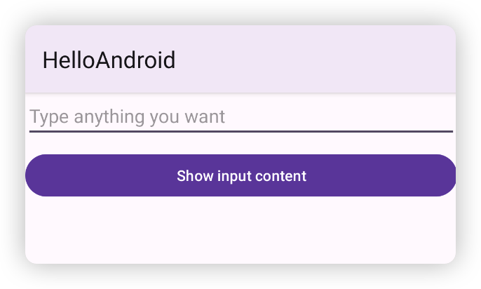
为了给用户提示输入框应该输入什么内容,Android 提供了输入框展示提示文字的能力,当用户输入了任意内容,这些提示文字就会消失,只需要添加一个 android:hint="" 属性即可,双引号中添加希望提示的文字。
<EditText
  android:id="@+id/et_input"
  android:layout_width="match_parent"
  android:layout_height="wrap_content"
  android:hint="Type anything you want"
  />
更多 EditText 的用法请查阅 EditText 官方 API 文档。
ImageView
ImageView 用来在界面上展示一张图片。图片的来源可以分为两种,一种是本地图片,一种网络图片。
本地图片资源一般是放在 res/drawable 目录下,并且需要注意带上分辨率,目前最主流的手机屏幕分辨率是 xxhdpi,因此需要在 res 目录下新建一个 drawable-xxhdpi 目录,将图片复制到这个目录中。
ImageView 中,最关键的属性是 android:src,可以在 XML 文件中通过这个属性来设置需要显示的图片。另外,ImageView 还提供了一系列设置图片的方法,常见的有:
setImageResource:通过 Resource ID 来加载本地图片资源setImageDrawable:将一个 Drawable 对象显示在 ImageView 中setImageBitmap:将一个 Bitmap 图像显示在 ImageView 中
<?xml version="1.0" encoding="utf-8"?>
<LinearLayout xmlns:android="http://schemas.android.com/apk/res/android"
    android:layout_width="match_parent"
    android:layout_height="match_parent"
    android:orientation="vertical">

    <ImageView
        android:id="@+id/image"
        android:layout_width="match_parent"
        android:layout_height="100dp"
        android:src="@drawable/apple"
        />
    <Button
        android:id="@+id/button"
        android:layout_width="match_parent"
        android:layout_height="wrap_content"
        android:text="Change image"
        android:layout_marginTop="10dp" />
</LinearLayout>
class ImageViewDemoActivity: AppCompatActivity() {

    private lateinit var image: ImageView
    private lateinit var button: Button

    override fun onCreate(savedInstanceState: Bundle?) {
        super.onCreate(savedInstanceState)
        setContentView(R.layout.activity_imageview_demo)
        image = findViewById(R.id.image)
        button = findViewById(R.id.button)
        button.setOnClickListener {
            image.setImageResource(R.drawable.banana)
        }
    }
}
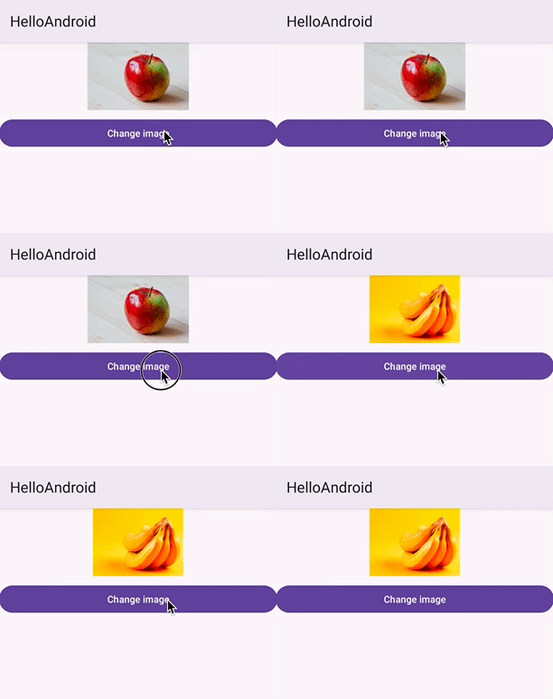
上面的例子中,我们首先在 XML 文件中通过 android:src="@drawable/apple" 指定展示苹果的照片,然后在 Activity 代码中,如果点击 Button,会调用 ImageView.setImageResource(R.drawable.banana) 方法将展示的图片改成香蕉的图片。 效果如下:
在展示图片时,图片在 ImageView 中的缩放模式(scaleType)也是非常重要的。这个属性指定了在 ImageView 中如何显示图片,是否缩放、是否拉伸等。Android 提供了 8 种值,分别是:
XML 中 android:scaleType 的取值 | 代码中 setScaleType 的入参 | 描述 | 示例(ImageView 是个正方形,紫色背景,图片是个长方形,且图片大小大于 ImageView 宽高) |
|---|---|---|---|
fitCenter | ImageView.ScaleType.FIT_CENTER | 默认模式,如果没有设置,则采用这种模式展示图片。 图片等比缩放到填充控件大小,并居中展示。 |  |
fitStart | ImageView.ScaleType.FIT_START | 图片等比例缩放到控件大小,并放置在控件的上边或左边。 | 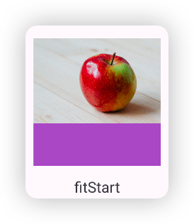 |
fitEnd | ImageView.ScaleType.FIT_END | 图片等比例缩放到控件大小,并放置在控件的下边或右边。 | 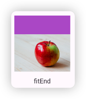 |
fitXY | ImageView.ScaleType.FIT_XY | 图片在长宽方向上拉伸或者缩放到控件大小,完全填充控件,注意不是等比例缩放。 | 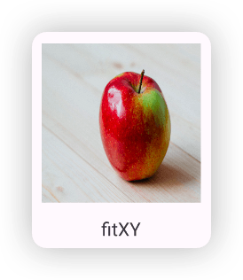 |
center | ImageView.ScaleType.CENTER | 不缩放,ImageView 展示图片的中心部分,也就是图片的中心点和 ImageView 的中心点重叠。如果图片大小小于 ImageView 的宽高,图片居中显示。 | 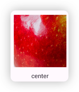 |
centerCrop | ImageView.ScaleType.CENTER_CROP | 最常用的模式,图片被等比缩放知道完全填充整个 ImageView,并居中显示。 |  |
centerInside | ImageView.ScaleType.CENTER_INSIDE | 如果图片大小大于 ImageView 宽高,则图片会被等比例缩小到能够完整显示在 ImageView 中,居中显示。(和 fitCenter 效果一样) 如果图片大小小于 ImageView 宽高,则直接居中显示,不会对图片进行放大操作(和 fitCenter 不一样) |  |
matrix | ImageView.ScaleType.MATRIX | 需要和 setImageMatrix(Matrix matrix) 方法配合使用。因为该模式需要指定一个变换矩阵来控制图片如何展示。其实前面 7 种模式都是 ImageView 内容生成了相应的变换矩阵,属于是这个模式的几种预定义场景,使用这个模式,只要传入对应的变换矩阵,也能实现上面 7 中显示效果。注意:需要先调用 setScaleType 在调用 setImageMatrix | 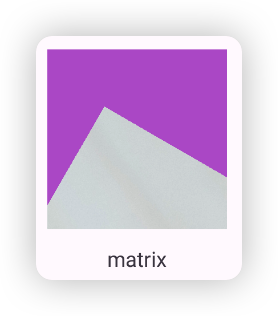 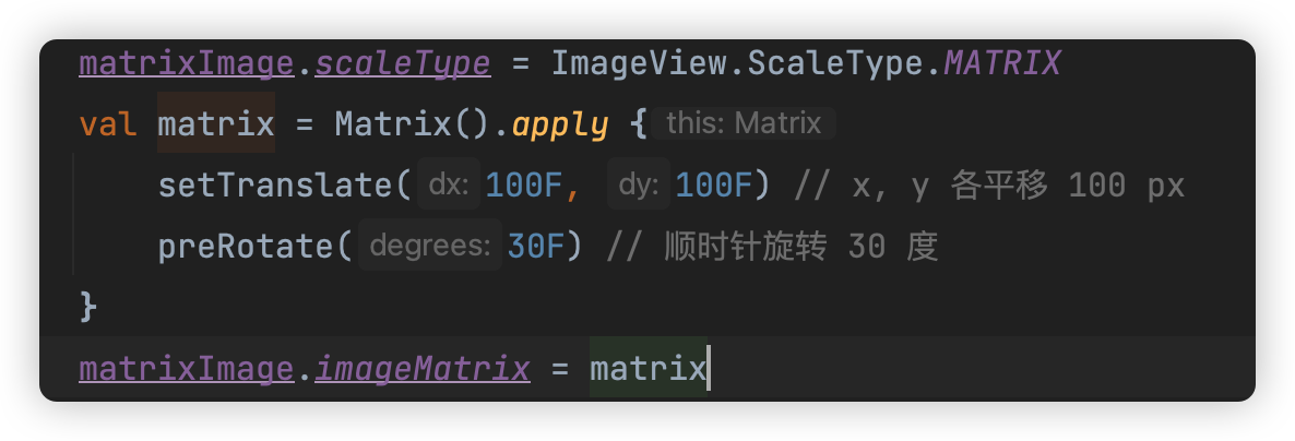 |
更多关于 ImageView 的用法,可以查阅 ImageView 官方 API 文档。
基础布局
除了一些基础控件,我们还需要一些布局控件将这些控件按照我们期望的方式排列在屏幕上。布局是一种可以放置多个控件的容器,它可以按照一定规律调整内部控件的位置,从而实现精美的界面。布局里也可以放置布局,通过布局的嵌套实现复杂的界面。
常见常用的基础布局控件有:
- FrameLayout
- LinearLayout
- ReletiveLayout
下面依次来看看。
FrameLayout
FrameLayout 翻译过来叫做 帧布局,这个布局中的控件像一帧一帧的图像一样堆叠在一起,默认放置在布局的左上角,后添加的控件会覆盖在之前的控件上。
来看看实际的例子:
<?xml version="1.0" encoding="utf-8"?>
<FrameLayout xmlns:android="http://schemas.android.com/apk/res/android"
    android:layout_width="match_parent"
    android:layout_height="match_parent">
    <View
        android:layout_width="200dp"
        android:layout_height="200dp"
        android:background="@color/colorPrimary" />
    <View
        android:layout_width="150dp"
        android:layout_height="150dp"
        android:background="@color/colorAccent" />
    <View
        android:layout_width="100dp"
        android:layout_height="100dp"
        android:background="@android:color/holo_orange_light" />
</FrameLayout>
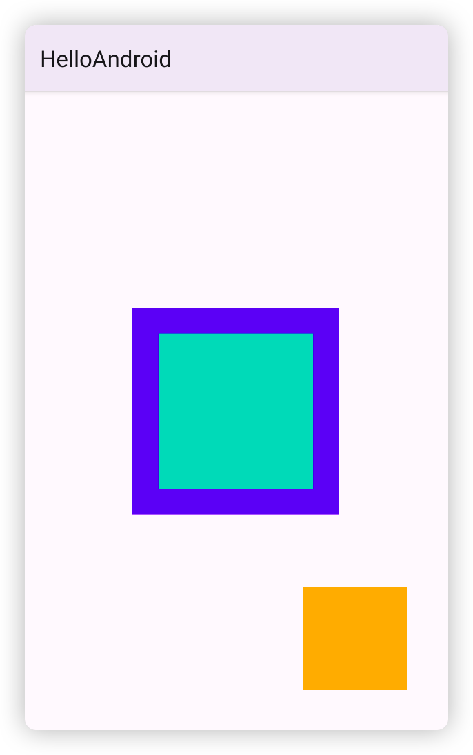
上面代码在一个 FrameLayout 布局中放置了三个色块控件,效果如下所示:
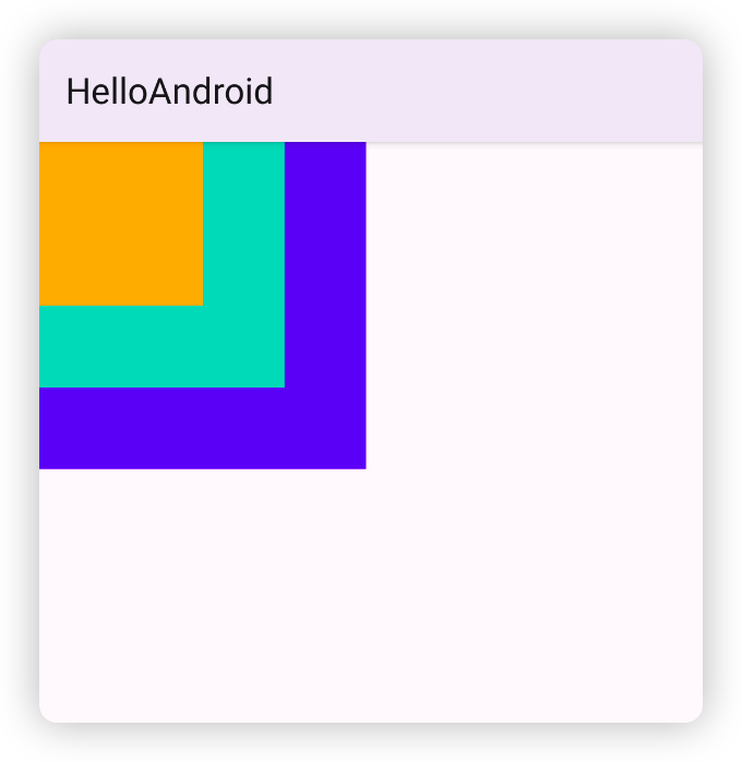
FrameLayout 中对子控件布局是通过给子控件添加 android:layout_gravity 属性,这个属性是控制控件相对于父布局的对齐方式,以及添加外边距(android:layout_margin)来实现。
比如上面的例子中我们给紫色和绿色的控件添加上 android:layout_gravity="center",给黄色控件添加上 android:layout_gravity="end|bottom" 和到右边、下边的边距:
<?xml version="1.0" encoding="utf-8"?>
<FrameLayout xmlns:android="http://schemas.android.com/apk/res/android"
    android:layout_width="match_parent"
    android:layout_height="match_parent">
    <View
        android:layout_width="200dp"
        android:layout_height="200dp"
        android:background="@color/colorPrimary"
        android:layout_gravity="center"/>
    <View
        android:layout_width="150dp"
        android:layout_height="150dp"
        android:background="@color/colorAccent"
        android:layout_gravity="center" />
    <View
        android:layout_width="100dp"
        android:layout_height="100dp"
        android:background="@android:color/holo_orange_light"
        android:layout_gravity="end|bottom"
        android:layout_marginBottom="40dp"
        android:layout_marginEnd="40dp" />
</FrameLayout>
效果如下:
FrameLayout 对子控件的定位方式比较简单,所以一般 FrameLayout 只在一些非常简单的布局场景中使用。
LinearLayout
LinearLayout 是叫做 线性布局,其中的控件会按照水平或者垂直的方向依次排列。如图所示:
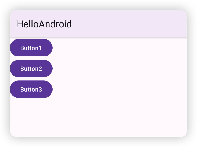
LinearLayout 通过 android:orientation 属性来指定是按水平还是垂直布局,可选的值有 horizontal 和 vertical,如果不指定,默认是 horizontal 。
看个例子:
- 垂直方向布局
<?xml version="1.0" encoding="utf-8"?>
<LinearLayout xmlns:android="http://schemas.android.com/apk/res/android"
    android:orientation="vertical"
    android:layout_width="match_parent"
    android:layout_height="match_parent">
    <Button
        android:layout_width="wrap_content"
        android:layout_height="wrap_content"
        android:text="Button1" />
    <Button
        android:layout_width="wrap_content"
        android:layout_height="wrap_content"
        android:text="Button2" />
    <Button
        android:layout_width="wrap_content"
        android:layout_height="wrap_content"
        android:text="Button3" />
</LinearLayout>
- 水平方向布局
<?xml version="1.0" encoding="utf-8"?>
<LinearLayout xmlns:android="http://schemas.android.com/apk/res/android"
    android:orientation="horizontal"
    android:layout_width="match_parent"
    android:layout_height="match_parent">
    <Button
        android:layout_width="wrap_content"
        android:layout_height="wrap_content"
        android:text="Button1" />
    <Button
        android:layout_width="wrap_content"
        android:layout_height="wrap_content"
        android:text="Button2" />
    <Button
        android:layout_width="wrap_content"
        android:layout_height="wrap_content"
        android:text="Button3" />
</LinearLayout>
注意:当 LinearLayout 的 orientation 是 horizontal 时,内部控件的宽度不能设置为 match_parent,否则单独一个控件就会占满水平方向的屏幕,后面的控件就无法展示了。同理,如果是 vertical 时,内部控件的高度不能设置为 match_parent。
LinearLayout 还有个非常重要且实用的属性是 android:layout_weight,这个属性是加在 LinearLayout 内的控件上,可以指定该控件在 LinearLayout 的权重。这个属性在屏幕适配性上起到非常重要的作用。
看个例子:
<LinearLayout
  android:layout_width="match_parent"
  android:layout_height="wrap_content"
  android:orientation="horizontal"
  android:layout_marginTop="40dp">
  <EditText
    android:layout_width="0dp"
    android:layout_height="wrap_content"
    android:layout_weight="1"
    android:hint="Type something" />
  <Button
    android:layout_width="0dp"
    android:layout_height="wrap_content"
    android:layout_weight="1"
    android:text="Search" />
</LinearLayout>
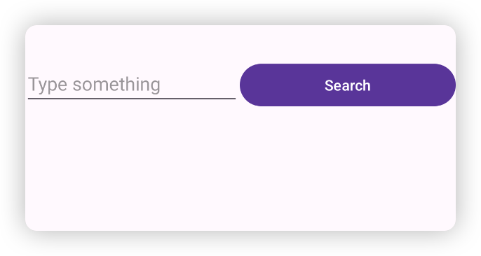
上面这段代码中,EditText 和 Button 控件水平排布在 LinearLayout 中,但是它们的宽度指定为 0dp,同时加上了 android:layout_weight="1" 的属性,这时候 EditText 和 Button 会平分整个屏幕的宽度。效果如图:
layout_weight 的原理是系统会把 LinearLayout 下所有控件指定的 layout_weight 值相加,得到一个总值,然后每个控件所占大小就是该控件的 layout_weight 值除以总值。如果希望 EditText 占 3/5,Button 占 2/5,则可以将 EditText 的 layout_weight 值设为 3,Button 的 layout_weight 值设为 2。
这是控件宽度都设置为 0dp 时的简单计算方式,完整的计算规则可以自行了解。
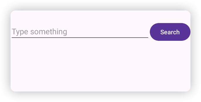
还可以让 Button 的宽度是 wrap_content,EditText 宽度设为 0dp,layout_weight 值设为 1。这样 EditText 就会占据除了 Button 之外剩余的屏幕宽度。
<LinearLayout
  android:layout_width="match_parent"
  android:layout_height="wrap_content"
  android:orientation="horizontal"
  android:layout_marginTop="40dp">
  <EditText
    android:layout_width="0dp"
    android:layout_height="wrap_content"
    android:layout_weight="1"
    android:hint="Type something" />
  <Button
    android:layout_width="wrap_content"
    android:layout_height="wrap_content"
    android:text="Search" />
</LinearLayout>
RelativeLayout
RelativeLayout 是 相对布局。RelativeLayout 是通过相对定位的方式让控件出现在布局的任何位置,使用上非常灵活,可以实现非常复杂的界面效果。
我们来看下 RelativeLayout 的属性:
-
和父布局的位置关系,取值都是 true 或者 false
-
android:layout_aliginParentTop:控件顶部与父布局顶部对齐, 默认为 true -
android:layout_aliginParentBottom:设为 true 时,控件底部与父布局底部对齐 -
android:layout_aliginParentLeft:控件左边与父布局左边对齐,默认为 true -
android:layout_aliginParentStart:控件左边(RTL 下右边)与父布局左边(RTL 下右边)对齐,默认为 true -
android:layout_aliginParentRight:设为 true 时,控件右边与父布局右边对齐 -
android:layout_aliginParentEnd:设为 true 时,控件右边(RTL 下左边)与父布局右边(RTL 下左边)对齐 -
android:layout_centerHorizontal:设为 true 时,控件在父布局水平方向上居中 -
android:layout_centerVertical:设为 true 时,控件在父布局垂直方向上居中 -
android:layout_centerInParent:设为 true 时,控件在父布局水平垂直方向上都居中
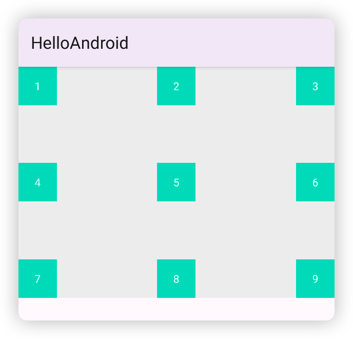
我们可以利用这些属性,实现一个九宫格的子控件排列:
<?xml version="1.0" encoding="utf-8"?>
<RelativeLayout
    xmlns:android="http://schemas.android.com/apk/res/android"
    android:layout_width="match_parent"
    android:layout_height="300dp"
    android:background="#F0F0F0">

    <!--  默认是居上居左的,所以不用写  -->
    <TextView
        android:layout_width="50dp"
        android:layout_height="50dp"
        android:background="@color/colorAccent"
        android:textColor="#FFFFFF"
        android:text="1"
        android:gravity="center"
        />

    <!--  添加一个水平方向居中,整体是垂直方向居上,水平方向居中  -->
    <TextView
        android:layout_width="50dp"
        android:layout_height="50dp"
        android:background="@color/colorAccent"
        android:textColor="#FFFFFF"
        android:text="2"
        android:gravity="center"
        android:layout_centerHorizontal="true"
        />

    <!--  添加一个右边和父布局右边对齐,整体是垂直方向居上,水平方向居右  -->
    <TextView
        android:layout_width="50dp"
        android:layout_height="50dp"
        android:background="@color/colorAccent"
        android:textColor="#FFFFFF"
        android:text="3"
        android:gravity="center"
        android:layout_alignParentEnd="true"
        />

    <!--  添加一个垂直方向居中,整体是垂直方向居中,水平方向居左  -->
    <TextView
        android:layout_width="50dp"
        android:layout_height="50dp"
        android:background="@color/colorAccent"
        android:textColor="#FFFFFF"
        android:text="4"
        android:gravity="center"
        android:layout_centerVertical="true"
        />

    <!--  添加一个水平垂直方向居中,整体是垂直和水平方向都居中  -->
    <TextView
        android:layout_width="50dp"
        android:layout_height="50dp"
        android:background="@color/colorAccent"
        android:textColor="#FFFFFF"
        android:text="5"
        android:gravity="center"
        android:layout_centerInParent="true"
        />

    <!--  添加一个垂直方向居中,右边和父布局右边对齐,整体是垂直方向居中,水平方向居右  -->
    <TextView
        android:layout_width="50dp"
        android:layout_height="50dp"
        android:background="@color/colorAccent"
        android:textColor="#FFFFFF"
        android:text="6"
        android:gravity="center"
        android:layout_centerVertical="true"
        android:layout_alignParentEnd="true"
        />

    <!--  添加一个底部和父布局底部对齐,整体是垂直方向居下,水平方向居左  -->
    <TextView
        android:layout_width="50dp"
        android:layout_height="50dp"
        android:background="@color/colorAccent"
        android:textColor="#FFFFFF"
        android:text="7"
        android:gravity="center"
        android:layout_alignParentBottom="true"
        />

    <!--  添加一个底部和父布局底部对齐,水平方向居中,整体是垂直方向居下,水平方向居中  -->
    <TextView
        android:layout_width="50dp"
        android:layout_height="50dp"
        android:background="@color/colorAccent"
        android:textColor="#FFFFFF"
        android:text="8"
        android:gravity="center"
        android:layout_alignParentBottom="true"
        android:layout_centerHorizontal="true"
        />

    <!--  添加一个底部和父布局底部对齐,右边和父布局右边对齐,整体是垂直方向居下,水平方向居右  -->
    <TextView
        android:layout_width="50dp"
        android:layout_height="50dp"
        android:background="@color/colorAccent"
        android:textColor="#FFFFFF"
        android:text="9"
        android:gravity="center"
        android:layout_alignParentBottom="true"
        android:layout_alignParentEnd="true"
        />
</RelativeLayout>
除了和父布局的位置关系,还可以指定一个控件与另一个控件的位置关系:
- Align 关系
android:layout_aliginTop:传入另一个控件的 ID, 当前控件顶部与 ID 对应的控件顶部对齐android:layout_aliginBottom:传入另一个控件的 ID, 当前控件底部与 ID 对应的控件底部对齐android:layout_aliginLeft:传入另一个控件的 ID, 当前控件左边与 ID 对应的控件左边对齐android:layout_aliginStart:传入另一个控件的 ID, 当前控件左边(RTL 下右边)与 ID 对应的控件左边(RTL 下右边)对齐android:layout_aliginRight:传入另一个控件的 ID, 当前控件右边与 ID 对应的控件右边对齐android:layout_aliginEnd:传入另一个控件的 ID, 当前控件右边(RTL 下左边)与 ID 对应的控件右边(RTL 下左边)对齐
- 上下或者左右关系
android:layout_above:指定当前控件在另一控件的上方android:layout_below:指定当前控件在另一控件的下android:layout_toLeftOf:指定当前控件在另一控件的左边android:layout_toStartOf:指定当前控件在另一控件的左边(RTL 下右边)android:layout_toRightOf:指定当前控件在另一控件的右边android:layout_toEndOf:指定当前控件在另一控件的右边(RTL 下左边)
下面来看个例子:
<RelativeLayout
  android:layout_width="match_parent"
  android:layout_height="300dp"
  android:layout_marginTop="50dp"
  android:background="#F0F0F0">

  <TextView
    android:id="@+id/anchor"
    android:layout_width="wrap_content"
    android:layout_height="50dp"
    android:background="#000000"
    android:textColor="#FFFFFF"
    android:text="锚点控件"
    android:gravity="center"
    android:layout_centerInParent="true"
    />
  <TextView
    android:layout_width="wrap_content"
    android:layout_height="50dp"
    android:background="@color/colorAccent"
    android:textColor="#FFFFFF"
    android:text="在锚点控件上方"
    android:gravity="center"
    android:layout_above="@id/anchor"
    />
  <TextView
    android:layout_width="wrap_content"
    android:layout_height="50dp"
    android:background="@android:color/holo_orange_light"
    android:textColor="#FFFFFF"
    android:text="在锚点控件下方,左边对齐"
    android:gravity="center"
    android:layout_below="@id/anchor"
    android:layout_alignStart="@id/anchor"
    />
  <TextView
    android:layout_width="wrap_content"
    android:layout_height="100dp"
    android:background="@color/colorPrimary"
    android:textColor="#FFFFFF"
    android:text="在锚点控件右边20dp,底部对齐"
    android:gravity="center"
    android:layout_toEndOf="@id/anchor"
    android:layout_marginStart="20dp"
    android:layout_alignBottom="@id/anchor"
    />
</RelativeLayout>
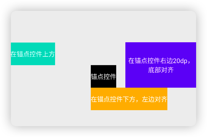
上面代码中在 RelativeLayout 中放置了 4 个控件,其中黑色控件作为锚点控件,相对于父布局水平垂直居中。其他 3 个控件的位置都是相对这个锚点控件来排布的。
- 绿色控件设置了
android:layout_above="@id/anchor",位置在锚点控件的上方(绿色控件的底部和锚点控件的顶部对齐),因为没有设置水平方向的对齐关系,所以默认是相对于父布局居左。 - 黄色控件设置了
android:layout_below="@id/anchor"和android:layout_alignStart="@id/anchor",位置在锚点控件的下方(黄色控件的顶部和锚点控件的底部对齐),并且左边和锚点控件的左边对齐 - 紫色控件设置了
android:layout_toEndOf="@id/anchor",android:layout_marginStart="20dp"和android:layout_alignBottom="@id/anchor",它的位置就是在锚点控件右边 20dp 处,并且底部和锚点控件底部对齐。
实际效果如下:
其他常用控件
ProgressBar
ProgressBar 用来在界面上显示一个进度条,表示应用正在加载一些数据。Android 提供了两种样式的进度条,一种圆形进度条(circular),一般不表示进度;一种是水平进度条(),一般可以表示加载进度。
先来看看圆形进度条,只需要在 XML 文件中添加一个 <ProgressBar /> 控件即可,默认的样式就是圆形进度条。
<?xml version="1.0" encoding="utf-8"?>
<LinearLayout xmlns:android="http://schemas.android.com/apk/res/android"
    android:layout_width="match_parent"
    android:layout_height="match_parent"
    android:orientation="vertical">

    <ProgressBar
        android:id="@+id/circular_progress"
        android:layout_width="match_parent"
        android:layout_height="wrap_content"
        />
    <Button
        android:id="@+id/button"
        android:layout_width="match_parent"
        android:layout_height="wrap_content"
        android:text="Show or hide progressbar"
        android:layout_marginTop="10dp" />
</LinearLayout>
class ProgressBarDemoActivity: AppCompatActivity() {

    private lateinit var progressBar: ProgressBar
    private lateinit var button: Button

    override fun onCreate(savedInstanceState: Bundle?) {
        super.onCreate(savedInstanceState)
        setContentView(R.layout.activity_progressbar_demo)
        progressBar = findViewById(R.id.circular_progress)
        button = findViewById(R.id.button)
        button.setOnClickListener {
            if (progressBar.visibility == View.VISIBLE) {
                progressBar.visibility = View.INVISIBLE
            } else {
                progressBar.visibility = View.VISIBLE
            }
        }
    }
}
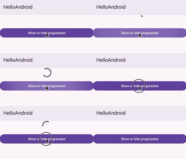
上面的代码中在界面上放置了一个圆形进度条和一个按钮,当点击按钮时,进度条会在显示和隐藏两种状态下切换。效果如下:
水平进度条需要在 <ProgressBar /> 控件中增加一个 style="?android:attr/progressBarStyleHorizontal" 的样式属性。水平进度条还可以通过 android:max 属性给进度条设置一个最大值,然后在代码中动态修改进度条的当前进度,最大值通常设为 100。
<?xml version="1.0" encoding="utf-8"?>
<LinearLayout xmlns:android="http://schemas.android.com/apk/res/android"
    android:layout_width="match_parent"
    android:layout_height="match_parent"
    android:orientation="vertical">

    <ProgressBar
        android:id="@+id/horizontal_progress"
        android:layout_width="match_parent"
        android:layout_height="wrap_content"
        style="?android:attr/progressBarStyleHorizontal"
        android:max="100"
        />
    <Button
        android:id="@+id/button1"
        android:layout_width="match_parent"
        android:layout_height="wrap_content"
        android:text="Add progress"
        android:layout_marginTop="10dp" />
</LinearLayout>
class ProgressBarDemoActivity: AppCompatActivity() {

    private lateinit var progressBar1: ProgressBar
    private lateinit var button1: Button

    override fun onCreate(savedInstanceState: Bundle?) {
        super.onCreate(savedInstanceState)
        setContentView(R.layout.activity_progressbar_demo)

        progressBar1 = findViewById(R.id.horizontal_progress)
        button1 = findViewById(R.id.button1)
        button1.setOnClickListener {
            progressBar1.progress = progressBar1.progress + 10
        }
    }
}
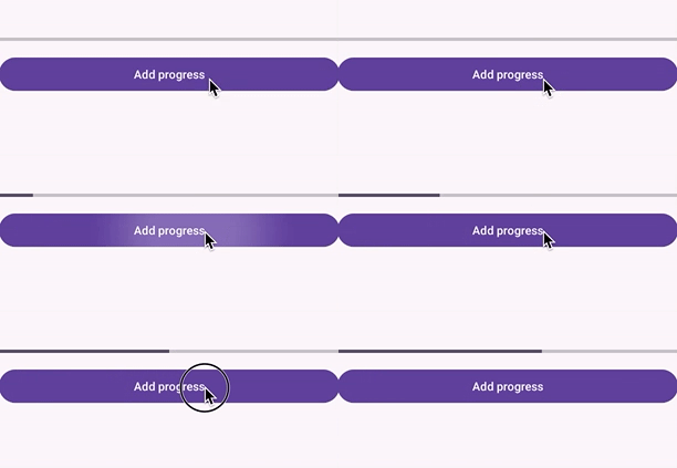
上面代码中在界面上放置了一个水平进度条和一个按钮,每次点击按钮,都会给进度条增加 10 的进度。效果如下:
一般系统的进度条样式是和实际开发的 App 主题不一致的,因此通常情况下都需要根据 App 的主题来自定义 ProgressBar 的颜色等样式,这里限于篇幅就不介绍了,可以自行了解。 更多用法可以查阅 ProgressBar 官方 API 文档。
AlertDialog
AlertDialog 可以在当前界面上弹出一个对话框(通常也叫弹窗),这个对话框时覆盖在所有界面元素之上的,能够屏蔽底下其他控件的交互能力。因此 AlertDialog 一般用来提示一些非常重要的内容或者警告类型的信息,比如为了防止用户误操作,在关键步骤执行前,需要弹出一个确认对话框让用户进行二次确认。
AlertDialog 使用时,就不需要在 XML 文件里写相应的控件了,而是直接在需要的时候通过代码构建出一个对话框并进行展示。
- 首先通过
AlertDialog.Builder配置对话框中内容和行为,常见的可以配置的内容有:setTitle:设置对话框的标题setMessage:设置对话框的内容setCancelable:设置点击对话框外面的蒙层或者返回键是否能让对话框消失,默认值为 true, 设置为 false 时,不能消失,此时需要注意对话框中一定要有按钮能让用户点击使对话框消失,否则对话框将一直展示setPositiveButton:设置积极行为的按钮上的内容和点击事件setNegativeButton:设置消极行为的按钮上的内容和点击事件
- 然后通过
AlertDialog.Builder.create方法创建出AlertDialog对象 - 最后调用
AlertDialog.show方法来展示对话框。
class AlertDialogDemoActivity: AppCompatActivity() {

    private lateinit var button: Button

    override fun onCreate(savedInstanceState: Bundle?) {
        super.onCreate(savedInstanceState)
        setContentView(R.layout.activity_button_demo)
        button = findViewById(R.id.cp_button)
        button.setOnClickListener {
            // 展示 Alertdialog
            val dialogBuilder = AlertDialog.Builder(this@AlertDialogDemoActivity).apply {
                setTitle("注销账号?")
                setMessage("注销账号后,您的所有信息将会在 7 天内删除,之后账号将不能登陆")
                setCancelable(false)
                setPositiveButton("确认") { dialog, witch ->
                    Toast.makeText(this@AlertDialogDemoActivity, "账号已删除", Toast.LENGTH_SHORT).show()
                }
                setNegativeButton("取消") { dialog, witch ->
                }
            }
            val alertDialog = dialogBuilder.create()
            alertDialog.show()
        }

    }

}
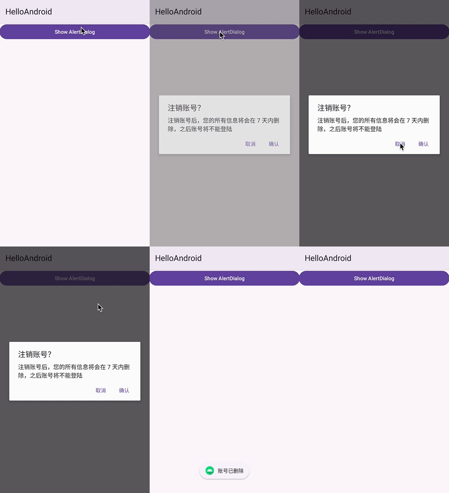
上面代码中,点击界面上的一个按钮,会展示一个注销账号提示的 AlertDialog。效果如下: